Journal
-
11Jun’14
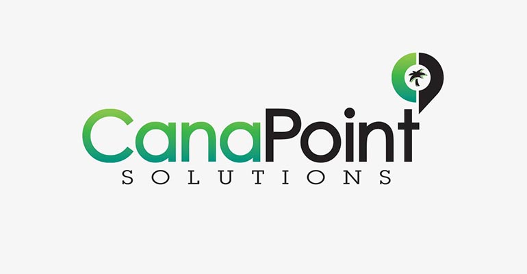
Cana Point Solutions is a top-up technology service provider that makes it possible for customers to pay online bills, cellphone bills, cable bills, etc with cash at local big box stores. CSD worked with ownership to help create new branding from scratch. The goal was to create a competitive identity that would distinguish Cana Point from other providers like Blackhawk Networks and InComm.
The branding process started with a discussion of answers in the customized CSD brand questionnaire. By asking targeted questions about company goals, vision, and the personality or voice that defines the brand, we’re able to define keywords and project success metrics. For this project our target demographic was national retail store franchises and we wanted to create an overall identity that reflected Cana Point’s competitive advantages. Sugar cane and the Dominican Republic have significance to the family owners and they wanted to reflect a modern, clean, professional style while including a reference to the Caribbean.
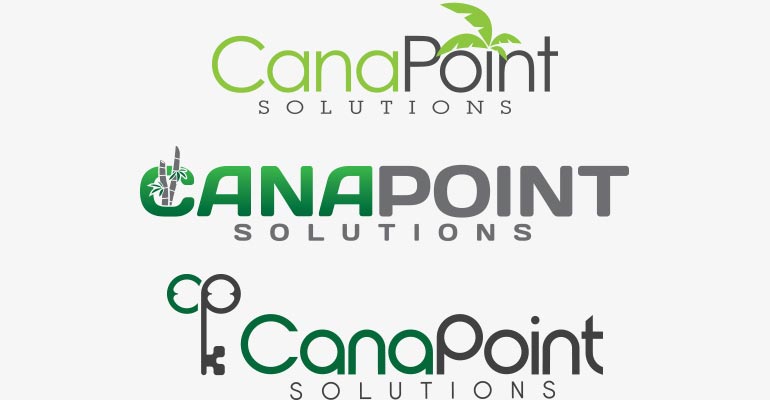
Through the first round of diverse design variations we were able to identify successful and unsuccessful elements and create a more targeted second round. We refined the color scheme, typeface, and graphic treatment to create the final brand identity.
The icon combines the letterform of both the “C” in Cana, and “P” in Point to create a location emblem. This locator acts as a branded indication that a store has top-up capabilities at the checkout counter.
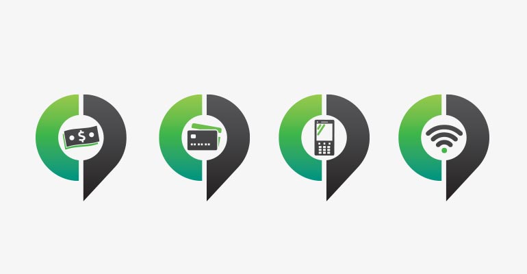
These images are the Cana Points 4 primary prepaid top-up products and services: Pay Check Services, Prepaid Credit Cards, Top-Up Cell Phones, and Internet Services.