Journal
-
07Feb’14
Clean Force Re-Branding
Posted by Rob Hyatt in Re-Branding and Logos
Working with the owner of ‘Gold Coast Building Services’ we realigned the visual identity as well as the naming system. Starting with a customized CSD brand questionnaire; we defined the target audience, competitive advantages, and vision for the company.
This commercial janitorial services company works in locations where security is paramount; laboratories, doctors offices, and professional service providers who store sensitive client information. The most important goal was to create trustworthy and secure identity.
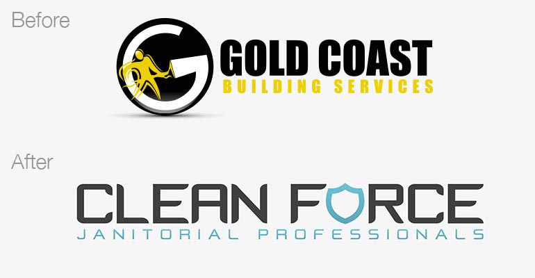
Throughout the re-branding process, we explored a few different names and strong design variations for each. The name we landed on was Clean Force, using a strong typographic treatment along with substituting the “o” with a shield to make it more visually interesting with a pop of color. The idea of Clean Force being a superhero like crew of trustworthy commercial cleaners really resonated with the client. By pairing a very clear descriptor (Janitorial Professionals) with a name that connotes security, we created a new identity that reflected the company vision.
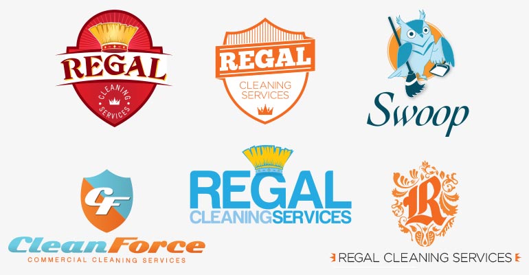
We worked through a few different name options, playing with the idea of nocturnal cleaning or refreshing an office so it’s clean every morning when the day starts. Below are some of the preliminary designs for Regal, Swoop, and Clean Force.